Windows 11's Start Menu
For application launchers, though, a spatial view is still the preferred approach. This is why Windows 11’s Start menu is so confusing to me.
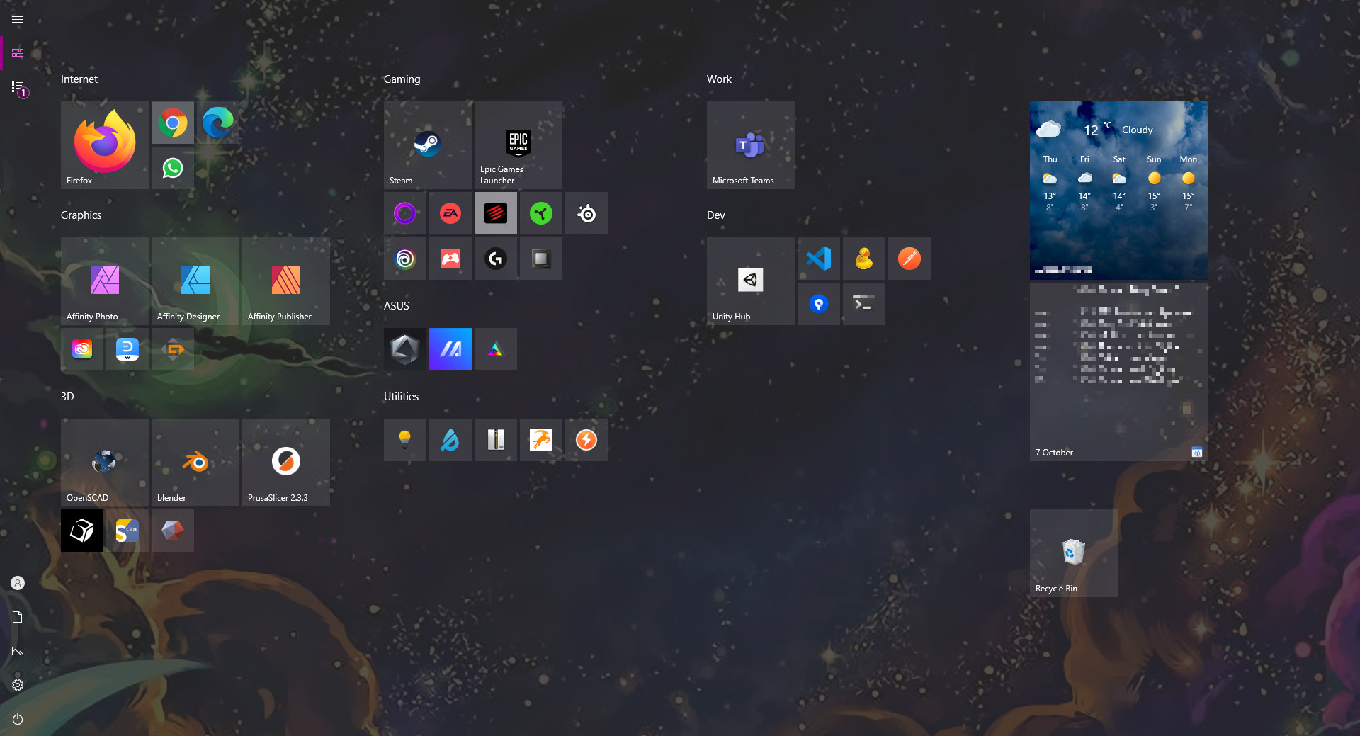
This is what my Start menu looked like in Windows 10: (ed)
This is by far the best home screen experience any operating system currently offers. Better than the app launcher on OS X, better than Android, better than iOS, better than any Linux distro I’ve seen.
(There's only so much I can quote without quoting the whole article, so go read it, it's not long.)
Lukas is right – Windows 10's Start menu is not a place I prefer to spend time, but it does let you use seldom implemented humane sensibilities. Big things can be big, tiny things can be tiny, related things can be grouped together. You are allowed to paint the walls, arrange the furniture and inhabit it; to make it yours.
In contrast, the goal of Windows 11's Start menu is seemingly to run from the past, towards the colorless, odorless grey goo of conformity in the alphabetized list of junk. It seems to have started from the idea that Windows had gotten everything wrong, and that for the sake of everyone's sanity, it should just absorb the characteristics of other systems. There is some merit to this idea and allowed them to escape the morass of Metro and Fluent/"acrylic", but it doesn't serve Windows 11 well in these areas.